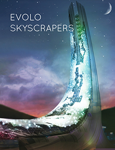
This project tackles the status of the icon in Architecture as they can pop up anywhere. The role of icon when thought of in a non-architectural sense can be related to icons in a logo sense which is a representation blurb of a company, application, commands, signs, etc. So to make the icon itself the project uses a means of graphic representation to distinguish itself from the context. Icons in a buildings sense may or may not have a relationship to its context in any sense form, space, material, etc. What all icons have in common is anyone of any culture who visits a city or place automatically know where they want to go when they visit that place, such as the Colosseum in Rome, the Disney Concert Hall in Los Angeles and so on.
The representation means was used to make something that could be distinguished by any culture. The forms, the massing, and the colors were all appropriated from the Pop Art and Super Flat Movement, the surface (window) projection follows the rules of the 4 square grid in pop art but without division between the varying colors. And the false window figures wrap the massing new facial expressions are formed as the figure becomes distorted. The idea was to create something relatively familiar by any culture but to not be tied to any at the same time. The project interacts with two other massing on the site who’s forms and surfaces derive from fashion influences, and the cubist movement. Collectively this project does not strive to relate to its context in a physical sense but rather a cultural sense where Art and Architecture are collapsed into one.
Critics: Elena Manferdini / Ryan Tyler Martinez
School: UC Berkeley/SCI-Arc collaboration
Students: Charles Shelton Green, Alberto Benejam, Yeseul Allie Chung


