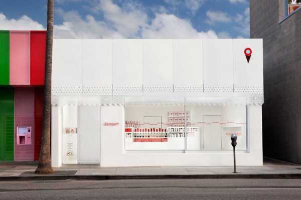
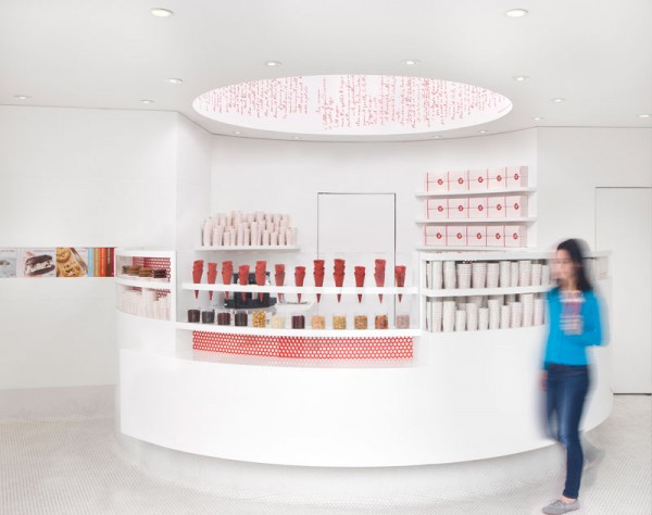
Lead designer and architect, Andrea Lenardin from a l m project, created the beautiful décor at Sprinkles Ice Cream, opened in May of 2012. For Sprinkles Ice Cream, the new venture of Sprinkles, it was just as important to be identifiable as a new member of the Sprinkles family, as to create a brand that simply celebrates ice cream, its heritage, and its iconography.
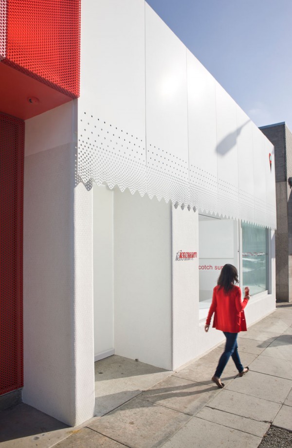
Exterior like interior derive from a minimalistic design approach and are brought to life by the ample flow of natural light and shadow play. The sparse white façade consists of metal shields with a laser-cut perforation along Sprinkles signature scalloped line applied to the bottom edge. The illuminated cone logo at the top right and a pin-mounted red script “icecream” next to entrance along with the crowd populating the indoor/outdoor bench stretching across almost the entire width of the façade entice you to enter.
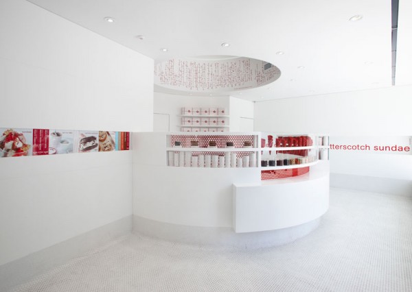
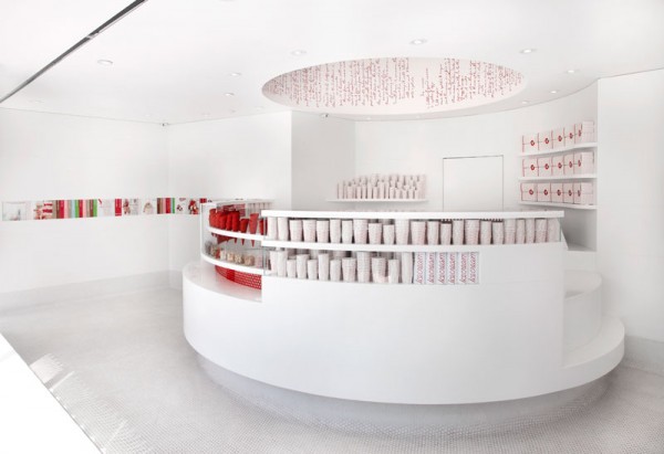
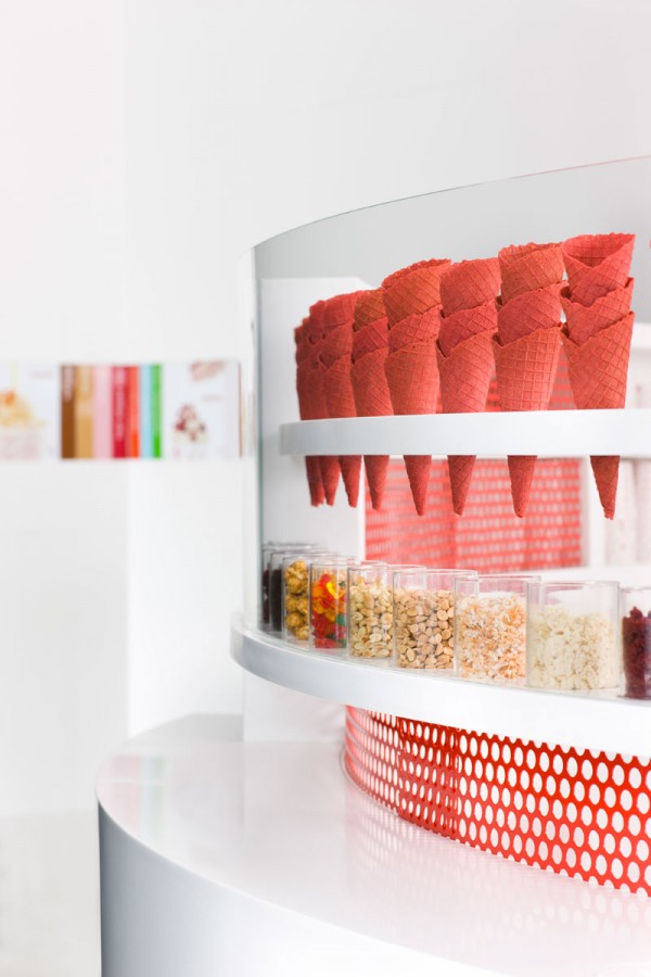
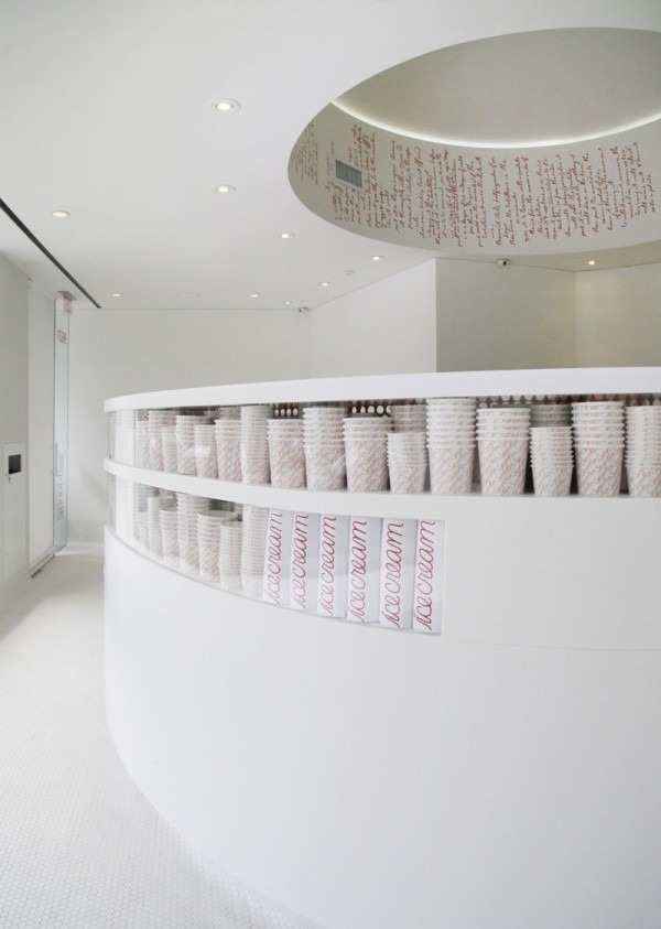
Expressing the creamy quality of ice cream, the interior space is defined by the smooth shapes of its main material, white corian, which is employed for both the round counter center piece and the walls. Accentuated by the pattern of the penny tile base & floor (an analogy to the classic ice cream shop in Europe) and red perforated metal sliders mounted service-side of the display cases, the built-in cabinetry fully integrates both equipment and product. Highly specific and carefully detailed, the center piece of the space is further defined by the light rotunda above that features Thomas Jefferson’s original ice cream recipe, a metaphor for Sprinkles’ approach to make handcrafted American ice cream.
photos: Trevor Dixon

