Editor’s Choice
2015 Skyscraper Competition
Ming Liu, Chen Chen, Chao Nie, Hua Deng, Yinhan Zhou
China

People living in Beijing now is suffering from breathing the air which contain more than 200 ug/m3 PM2.5 and spending more than 2 hours from home to work because the traffic jam caused by the excessive expansion( to the 5th ring road) of city. Land is occupied while city is expanding, thus the plants and animals living on it before are forced to disappear. The ecological cycle of nature is broken so that human has to face the negative results like extremely high urban density, serious air pollution, heavy traffic and so on.
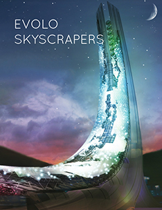
The “Land Liberator” skyscraper is a series of skyscrapers located in Beijing in the future to absorb the high-rise buildings on land into the inner space of it and put the public buildings, streets, residents on the top of it, in order to free the land from human occupation thus the plants and animals will return to live on it. The generating of the inner space of the “Land Liberator” is an intelligent process by analyzing the Bigdata about following aspects: functions of high-rise buildings, preferences of buildings` users, location and so on.
The lower-zone of the “Land Liberator” has 2 parts. One is the supporting structure which has 6 legs standing on the land when another is the first part of inner space for buildings on land to regenerate in. Within the lower-zone, there are lots of platforms opening to air where we can plant trees on, which make this Skyscraper with better natural environment than the high-rise buildings nowadays.
The central-zone and upper-zone of the “Land Liberator” is similar to the lower-zone but much bigger and we can find public buildings on the platform located on the top of the upper-zone. Between each zone there are parking-lots for aerocrafts so that people can conveniently reach every part of the “Land Liberator”.
Beijing is the specific city we want to place the “Land Liberator” skyscrapers.The “a ring road set a ring road outward” city development process is from inside of the city to outside. On the contrary of it, the “Land Liberators” will be placed at the edge of Beijing city firstly and absorb the buildings on land blocks by blocks, from outside to inside. This process is just like nibbling. The city will not be absorbed clearly in a couple years, as it is a long and gentle journey. By finishing this process, the land of Beijing will be full of plants and animals, the nature will heal the land as the ecological cycle is rebuilt, the surface that people living on will be moving to sky, the inner space of the “Land Liberators” will be properly planned by using the analysis of Bigdata and creating an intelligent process. Soon after, Beijing will be reborn in a hyper-eco condition. Read the rest of this entry »