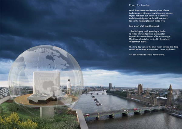
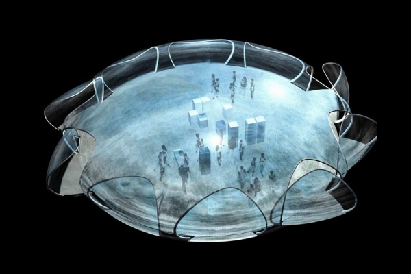
Perched amid the rooftops of London, between the Thames River and the sky above, a sphere of clear polycarbonate designed by Julian King Architect, 7 m in diameter, encases a room of 42 s.m. The shell is joined along aluminum rings that divide the world into its four meridians. Guests ascend a gentle ramp to the raised floor. Inside, a central sky-lit shower is encircled by a 180° riverside seat. To the south, a queen size bed looks onto a roof garden. The unique envelope is coated with photo-voltaics, solidified drops of silicone on transparent film, in the shape of the continents of the Earth; providing all the energy the small room requires. LEDs on the interior surface give the room an ethereal glow at night. From a distance, the global room appears to be a moon, or the Earth itself-and for a moment we see our own planet for the finite, singularly miraculous home that it is. Read the rest of this entry »
Clear Polycarbonate Room Above the Thames, London
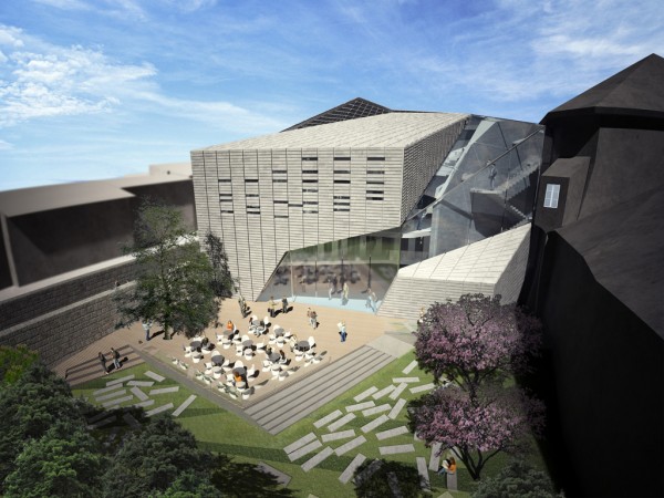
Brixen Public Library, Italy / Aquilialberg
The Aquilialberg project of the Brixen Public Library in Italy has the aim to become a new gathering location for the city’s population. Following this line, the project is designed to assure wide spaces for socialization, both interior and exterior, to accommodate public manifestations and cultural encounters. It is a place to spread knowledge, in which citizen could feel at ease and spend time constructively. A deep design study is conducted for the new volume; the starting point was the relationship with the existing volumes and geometries. Special attention is given to the orientation of the roofs’ slopes of the closest buildings, with the purpose to match it in the most elegant way with the new construction. The composition language, developed in the design of the new volume, came from the push of the existing roofs’ slopes towards the competition site – a void is generated and it worked as a hinge that matches the existing volumes with the new Library. The Hinge-Volume chosen material is glass to respect the relation between the historical past of the context and the new presence of the Library. Read the rest of this entry »
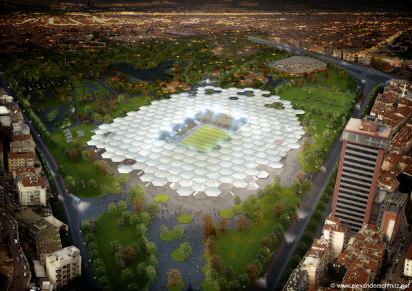
A Modern Football Stadium for Turkey
In hopes of securing the UEFA (European Union of Football Associations) EURO 2016 bid for Bursa, Turkey, the Turkey Football Federation commissioned German stadium design firm stadiumconcept to design a sparkling new stadium with a capacity of 33,000.
Unfortunately for everyone involved in the project, France was chosen to host the UEFA EURO 2016. But the stadium still stands as a possible new icon for this ancient, Islamic city.
Stadiumconcept, in cooperation with the structural engineer firm schlaich bergermann and partners, designed for Bursa the Hexagon Park Stadium, which, in addition to seating tens of thousands of crazed fans, would feature cafes, eateries, concerts and social events. Located minutes from Bursa’s downtown and situated in a cultural center of the city, the stadium sought to serve as a new icon for the city. Read the rest of this entry »
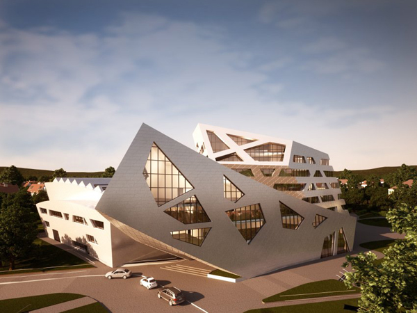
New Daniel Libeskind building in Germany creates controversy for Hamburg campus
In an attempt to climb the ranks from technical college to the Ivys, Lüneburg University (outside of Hamburg, Germany) has hired its part-time professor, famed American architect Daniel Libeskind, to design a new main building for its campus.
Despite grumblings from state officials about the $76 million price tag, and claims from student representatives that the design is impractical, school officials are sure that building something spectacular on campus will catapult the college’s reputation. As such, university administration announced in early January that it had secured funding for the project and was moving forward with its construction.
For its exterior, Libeskind, who has designed such major buildings as Berlin’s Jewish Museum, and has been involved in the new design for New York’s World Trade Center, has envisioned a silver grouping of stark, jagged geometry, with the roofline jutting sharply in unexpected areas. The structure will, at its tallest, be 124 feet, and will be able to accommodate 1,200 people. Officials hope construction will be complete by Easter 2014.
Initial design plans show a partial green roof and an atrium at the building’s top level. The sharp angles of the exterior carry inside, with oddly angular walls serving as a decorative element. Read the rest of this entry »
R129 Prototype Translucent Mono-shelter / Werner Sobek
The R129 prototype shelter by Werner Sobeck is a radical fusion of building sciences and material sciences to explore the potential of changeable space. The monospace design is intended to exist autonomously from the grid. The skin of the dome is 10 millimeter plastic skin which is self supporting across the entire roof span. An electrochromatic foil integrated into the skin will be able to switch from translucent to opaque in sections or as a whole. Controls can allow daylight in without overheating. An undisrupted series of fenestration allows the building to capture prevailing breezes and occupants to gain entrance from any point.
The interior is an open floor plan with no walls. Rooms are “created” by furniture, cabinets, and appliances that are inserted below floor level and rise when only when needed, thus making a relatively small living space functionally much larger. Heating, cooling, plumbing services and storage is also contained in the floor system. The design is intended to work completely off-grid as an independent, self supporting environment. The research involved in developing the R129 Prototype at the University of Stuttgart’s Institute for Lightweight Structures and Conceptual Design merges the disciplines of architecture and engineering to push the boundaries of thin materials in the building sciences, reducing material requirements while improving building performance. Read the rest of this entry »
Peace Pentagon in New York
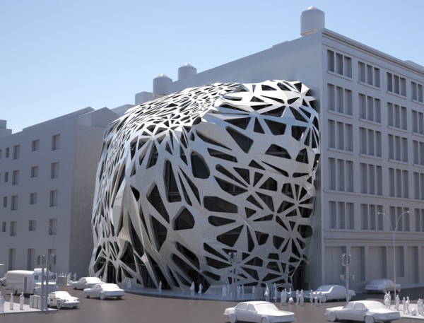
This scheme proposed by Graham Thompson is for the design of a “peace pentagon” which focuses on an experimental and challenging presence on 339 Lafayette Street in New York City, aiming to bring a central community node for the gathering of activist groups, a place for the public to visit and learn what each group is currently lobbying. Overall forming an enriched communal heart in the neighborhood.
Conceptually the form is derived from studies into morphological forms of evolution, assessing the structural integrity of such to propose an articulated skeletal typology, creating many openings, voids and scapes in the buildings primary skin. This language is brought throughout the building to create internal spaces whereby the architectural program and functioning starts to become clear.
The floor plans are organized to fulfill the needs of multi-changeable office plans, some require more space so open plan design is an option for some levels. Due to the amount of focus groups there is call for a separation of direct circulation routes creating a central atrium which fractures the buildings volume where each floor is served by communal relaxation spaces, some crossing through the atrium to give internal viewing points and ending with a rooftop café. This scheme establishes the awareness of having a public/private organization of spaces generating a hub for the desire for peace. Read the rest of this entry »
Cozy up in the Kissing Booth, a Canadian warming hut and skate tunnel
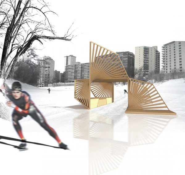
While romantic sparks may certainly fly while huddled for warmth in Shane Neufeld and Kevin Kunstadt’s “Kissing Booth,” the wooden warming hut isn’t named for just that. Instead, it refers to the way the different parts of the hut twist up from the ground to meet, and seemingly, kiss.
The architects, of the firm Rogers Marvel Architects, designed the Kissing Booth for the frozen Assiniboine River in Winnipeg, the largest city in Manitoba, Canada. The hut is designed with a roof and walls, but open entry ways, allowing skaters to breeze through the structure at high speeds.
One of the walls, however, features a bench, and behind it, a glassed-in bay window, allowing for relaxation inside the hut as well.
Planks of naturally stained wood fan up from the ground and up into the air, and meet at one small corner: a corner, the architects say, that is a “moment of charged contact” in the structure. The spaced spiraling of the wood beams allows for the play of light and shadow, an activation with the motion of the skaters, and skillfully, but not overwhelmingly, provides shelter. It seems to be in motion, mid-spiral, imagery that speaks to the skaters who utilize it; from its western side, however, the serene window bench also is defining, giving the simple structure an earthy and comfortable presence in the middle of the Assiniboine River. Read the rest of this entry »
Dali Museum in Florida Stays True to Artist’s Style
One of the most perfectly symmetrical times in our lifetime – 1-11-11 at 11:11 a.m. – was celebrated in St. Petersburg, Florida with the opening of a museum dedicated to surrealist artist Salvador Dali.
The museum is not new, but an expansion of the original site, which first opened in 1982. Now boasting 68,000 square feet, there is ample room for the museum’s 2,140-piece collection, which includes oils, watercolors, sketches and sculptures.
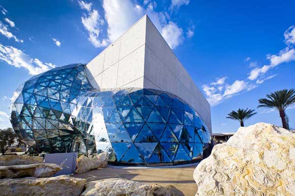
The museum was designed by Yann Weymouth, the director of design for the firm HOK in Florida. The 75-foot building is quite the work of art in itself; its exterior is comprised of 1,062 unique, triangular glass panels that form bubble domes to reflect the blue sky, and wrap around a traditional rectangular core. This design serves to reflect the flowing, larger-than-life images of Dali’s work, with the glass “Enigma,” as the designer calls it, serving the building’s life force. Its ethereal shape and texture contrasts sharply with the rough concrete core of the building, but this part was also integral to the design, as it protects the priceless works of art from hurricanes or other extreme incidents. This geometrical mass, with 18-inch thick reinforced concrete walls and a 12-inch thick roof, is referred to by the architect as the “Treasure Box.” The project cost $29.8 million.
“The flowing, free-form use of geodesic triangulation is a recent innovation enabled by modern computer analysis and digitally controlled fabrication that allows each component to be unique,” Weymouth was recently quoted by e-architect as saying. “No glass panel, structural node or strut is precisely the same. This permitted us to create a family of shapes that, while structurally robust, more closely resembles the flow of liquids in nature.” Read the rest of this entry »
Broad Art Museum: Adding another bold building to Los Angeles’ Grand Avenue
Los Angeles’ famed Walt Disney Concert Hall will soon have a neighbor whose architecture hopes to stand up to architect Frank Gehry’s bold concert hall design.
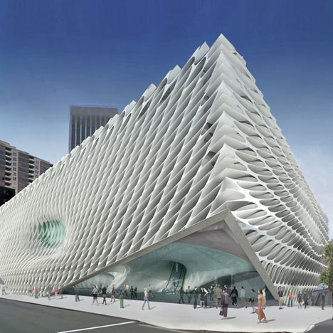
“The Broad,” the new museum of the Broad Art Foundation, will be located on Los Angeles’ Grand Street across from the concert hall and the Museum of Contemporary Art. The design, by New York firm Diller Scofidio + Renfro, is a white, modern honeycomb façade that is lit from the top, with the top floor gallery having a glass roof.
Nearly 2,000 pieces will be housed in the three-story, 120,000 square foot building. A third of that space alone, nearly an acre, will be devoted to column-free gallery space. Other public space will include a shop, bookstore, espresso café and lobby on the first floor, as well as an adjoining multi-media space.
The Broad will also offer ample archive, study and storage space so that the building can function holistically as an art institution, for both the public and scholars.
The architect, Elizabeth Diller, and funders Eli and Edythe Broad have referred to the building’s design as “the veil and the vault,” because of the dual nature of the use of the interior spaces. Because the museum’s archival work is so important, the building’s design ensures that the private research space, r “vault,” is visible instead of hidden away: located in the center of the building, the vault’s carved underside helps characterize the lobby, and its roof serves as an exhibition floor. Additionally, A winding stairway takes visitors from the lobby to exhibition space through the vault, offering behind-the-scenes peeks into the museum’s lending and collections operations. Read the rest of this entry »
Innovative Office Tower in Brisbane, Australia / Cox Rayner Architects
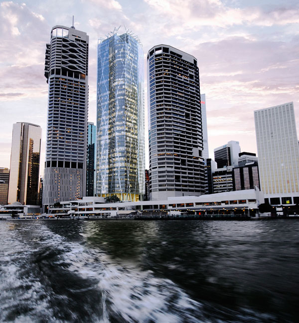
In troubled economic times, there is only one high rise office tower being built in Brisbane. So enamoured was the client, GPT, with the design by Cox Rayner Architects that he decided to proceed on the basis that the building’s aesthetic, environmental and workplace benefits would lure prospective tenants.
The tower’s structure is organic in that the columns twist and turn up its 45 storey height, emerging through the roof to form a tree-like canopy. The resulting filigree of structure reflects the city’s two iconic Fig Trees in the building’s forecourt, but the rationale for the concept was initially pragmatic. This was because the tower is being built over a wide existing loading dock such that there were few points on the ground where columns could land. Cox Rayner Architects with their engineers ARUP devised a structural system where loads could be gradually transferred diagonally down to the land predominantly on one side of the site, avoiding the dock.
The concept evolved with several attributes. The columns in the ‘web’ are abnormally thin at 600 – 400 wide, maximising views to the river. Less concrete is required than in conventional typologies entailing reduced embodied energy in construction. Overall the tower is currently measured to be above 6 star rating under the Green Building Council of Australia’s Green Star Design Rating System.
The tower has a corner services core that also maximises the availability of views to the office areas, with the structural frame wrapping around the remaining volume inside a glass skin with operable blinds responding to solar orientations.
The ground plane is designed as a public thoroughfare space linking the city to its main ferry terminal, such that the foyers are at the first level above. This design enriches the sense of lightness and space for which the building will become renowned. Read the rest of this entry »

